

The W in the name looks like something out of a horror movie. Check that, it looks like Chris Elliott's creepy left hand in Scary Movie 2:

Add in the fact that grey numbers look pretty bad on the gold uniforms, and these are easily Milwaukee's worst uniforms since the 2005-06/06-07 barely-any-gold unis.
All the thanks can go to Adidas, who designs all the uniforms. They promise a personal touch, yet it's quite obvious (thanks to PantherU and club football logo designer Nic Waldron for pointing this out) that the font is a rip-off of Louisville, with the V from Louisville modified into a W yet occupying the same amount of space. What results is a letter that looks significantly shorter than the rest of the letters, drawing the eye and making it look quite awkward.

We'll likely have to sit through this season with the dumb W on the jerseys. At least it's not a Badger Motion W.
In the meantime, look at what Waldron came up with - his own idea as to what kind of uniforms the Panthers should be wearing.
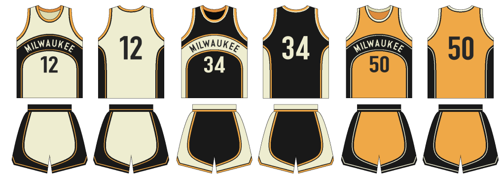
A few points:
- He basically modified the design from our throwback uniforms at the infamous Western Michigan game a couple years ago.
- Take it as a black and gold version of the best Seattle Supersonics uniforms, with the arch over the top.
- You don't need to adjust your screens, that isn't a white home jersey. Waldron instead decided to use cream, the color of so much concrete around Milwaukee - also known as "Cream City."
Are the W's that bad? Sure. Should it matter? Not according to Ryan Haggerty:
Idk why ppl are making a big deal about the "w" on our new jerseys. The only "w's" that matter are the ones we put in the left column! #uwm
— Ryan Haggs (@RHaggs_44) October 4, 2012
vBulletin Message